MEMBUAT NEW COVER PAGE, BLANK PAGE, DAN PAGE BREAK PADA MICROSOFT WORD
- Masuk pada aplikasi pada microsoft word.
- Ketik apa yg perlu diketik sebagai cover page, dan beri gambar atau logo.
- Setelah selesai mengetik, blok seluruh bagian yg ingin dijadikan cover page.
- Lalu klik insert, klik cover page yang berada disebelah paling kiri atas.
- Lalu klik save selection to cover page gallery
- Maka akan muncul gambar seperti dibawah ini
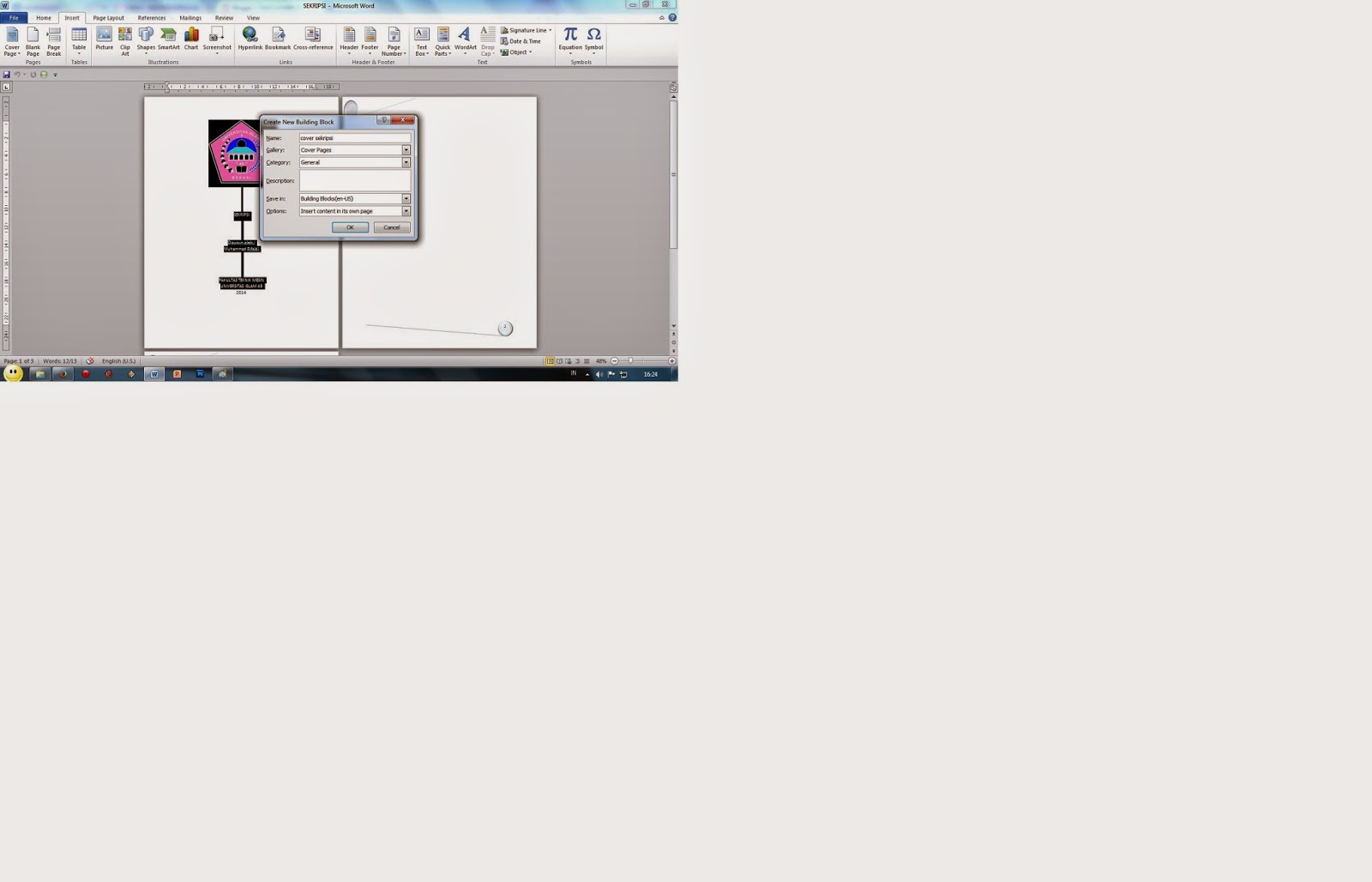
- Setelah muncul gambar seperti disamping, beri nama sesuai yang anda inginkan, lalu klik Ok.
- Maka new cover page yang anda buat telah tersimpan di cover page pada insert microsoft word.
- Dan di sebelah cover page terdapat Blank Page, anda bisa menggunakan blank page untuk menisipkan suatu halaman kosong diantara halaman yang ada. Penomoran yang anda buat pun akan berubah secara otomatis sesuai urutan yang ada. Cukup dengan memposisikan kursor anda sesuai anda ingin menambahkan halaman yang anda inginkan.
- Dan di sebelah blank page terdapat Page Break, anda bisa menggunakan page break untuk memberikan atau pun menyisipkan tanda batas pada halaman and. Cukup dengan meletakkan kursor diakhir paragraf maka paragraf selanjutnya akan terpisah pada halaman yang berbeda.
I'm on the fence about this, while more customization is good, I have a feeling this is a "in-progress" update, it just feels incomplete and half-way there.
BalasHapusWe use badge layout for apps on design approvals (visual projects), so the image being displayed is important. Old layout "feels like" it had larger images,
maybe because the images were cropped more loosely so it's easier to tell which project it was at quick glance. Now the image is cropped closer, making it
harder to scan thru at quick glance. I find myself needing to click into the project more often than usual. Which makes the whole user experience less
efficient.
I have a couple suggestions that might make it work better:
1. Increase the height of the window the cover image is being displayed.
2. Let us to choose which image to be displayed as "cover" (like how Pinterest handles cover images of each board, was hoping for this for a long time)
3. Let us adjust which part of the image to show and how tight or loose the crop is (with a fixed window, let us move the image around and maybe enlarge or
shrink it to control what shows thru the window. Pinterest does a limited form of this, which is very useful in making the cover image relevant)
4. Allow Cover Image to be ordered in different hierarchy (currently every element can be ordered differently except the Cover Image, it seems to be stuck
in the 2nd spot, would like the option to set it on another spot in the layout. This one seems like an easy fix, since you guys allow that for every other
element already)